Design Studio 2016–18
Design Studio 2016–18
Contents
- Unit 1: Overview & Assignment Keetra Dean Dixon
- Unit 2: Overview & Assignment Tom Ockerse
- Template and Print specs John Caserta
- Unit 3: Overview & Assignment John Caserta
- Critique Questions Tom Wedell
- Unit 4: Overview & Assignment Tom Wedell
- Unit 5: Overview & Assignment James Goggin
- Reflective Document DS1 team
- URLs of interest DS1 team
- Design Studio 1 syllabus DS1 team
1
2
3
4
5
etc
1
Unit 01: Keetra Dean Dixon
Question: How can you translate what you see into a graphic language?
In 1919 Kandinsky wrote an essay in which he used the metaphor of verbal “language” to discuss the laws of visual form, calling simple geometric shapes “forms belonging to the first sphere of graphic language.” He came up with the full metaphor of “visual language” not long after and it has since become a foundational concept in the study of graphic design.
In this assignment we’ll use the basic structures of language to lead an interpretive deconstruction of our surrounding, transforming them into a distinct graphic language. Just as paragraphs can be broken into words and words can be broken into letters, we’ll break photos of our environment into their basic formal elementals. We’ll translate those elements into new graphic forms, exploring a variety of materials and tools as we go. Your collection of forms will then be used to create new compositions, a graphic language all your own.
Learning Objectives:
• develop new form from what you see
• exercise an understanding of gestalt principles
• explore traditional and nontraditional tools & materials
• develop a distinct visual voice
• practice transparency of process & generosity with creative methods
Week 1
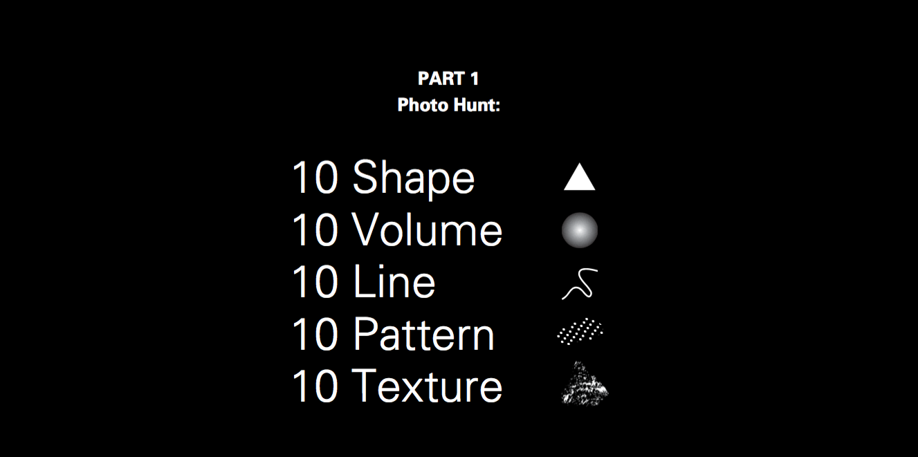
PART 1
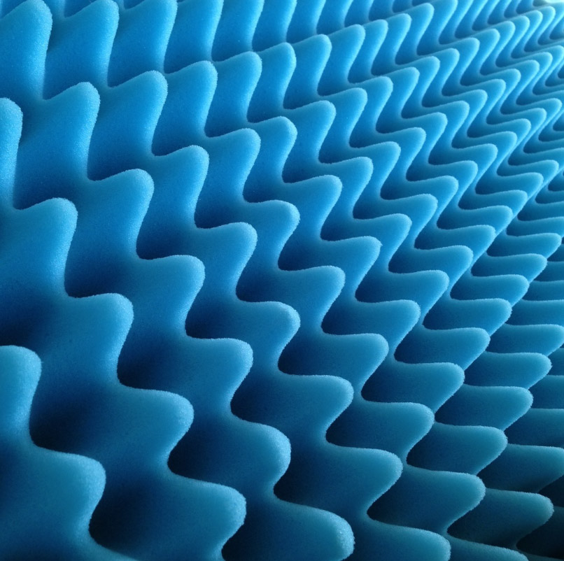
Photo Hunt for Form. 1 hour. During Class.
>Shoot a minimum of 10 photos for each of the following categories.
• Shape
• Volume
• Line
• Pattern
• Texture
Shoot Quickly!!! Don’t belabor the creation of these photos, you will be transforming them later. You are hunting for potential. Look for the inspiring, the beautiful, the curious, anything the prompts a graphic translation. Speedily capture what’s you see and start looking for the next opportunity to photograph. Seek diversity in your collection of images. These are your sources to work from later, take as many pictures as possible within the allotted time.
Return to class and prep for a casual, gallery style, laptop sharing.
PART 2
Create a collection of 25 grayscale, graphic forms.
You’ll now translate your photos into graphic form using a variety of materials and tools. Your final collection will be digital, but you’ll start with physical studies. Begin in class, then continue the process on your own.
In Class:
You must use each of the 5 Non-Traditional materials provided in class to begin your form translations. You may mix materials with one another, and use any additional tools you please.
After Class:
You are free to use the materials and tools of your choosing.
Non-traditional Materials & Tools (Use at least 5)
• needles
• thread/string
• marshmallows
• tissue
• toothpaste
• Vaseline
• salt/paper
• straws
• QTips
• balloons
• cotton balls
Traditional Materials & Tools (Use at least 5)
• paper
• tape
• Xacto knife
• mark making guides: S curve, ruler, stencil
• mark making: sharpies, pens, pencils, india ink, gouache, acrylic
• Adobe Suite: Illustrator, Photoshop, etc
• documentation tools: camera, scanner
• code: processing, javascript, etc
• 3D software: Cinema 4D, Blender, CAD, SketchUp, etc
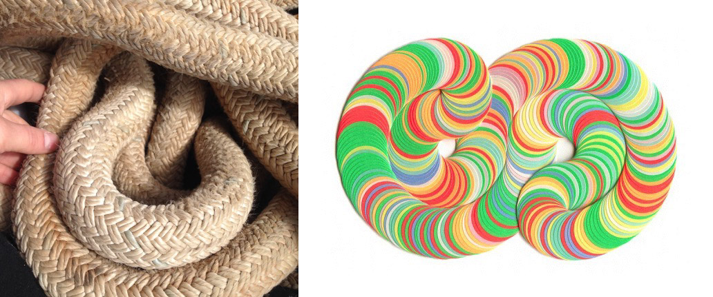
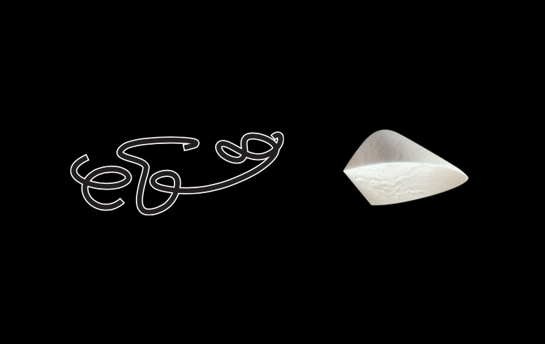
Translation Process:
Look at an individual element in your photo then translate it into a graphic form. There are no strict rules for the process of translation. It might be a simple procedure: Sketch an element, then scan that sketch. Or it might be several steps: Build a structure that mimics an element, then photograph the shadow cast by that structure, bring that shadow into photoshop and refine further, then map that image onto the surface of a digital 3D form. Create physical structures, mark make by hand, manipulate lighting, alter image with code, etc. Anything BUT the original photo can be used as a graphic form in your collection. The idea is to translate and evolve a new visual language distinct from, but inspired by, your original photos. Your voice will reveal itself when greater interpretation is required. Your tools and materials will reveal their influence in the translation process.
Pursue more than 25 studies, you’ll narrow and refine later. Start fast, creating looser studies and sampling a range of materials quickly. Misuse or intermingle materials and tools to force unexpected results. When you discover a promising process, put more time into crafting the technique. Keep your camera close or be ready to take screen shots. Document the steps in your technique to share later. A successful technique does not need to be complex, the strength of the final form determines its worth. As you work in class, keep in mind that your final collection of graphic forms will be digital. Digitize your physical work before the end of class or make a plan to cleanly transport your physical studies for continued work at home.
Homework
Now is the time for editing. Review your source photos for new opportunities and assess your work from class. Notice themes and similarities, consider the diversity of your in process collection. When narrowing down your collection, seek contrast of structure, scale, weight, line, density, mass, simplicity, chaos, etc. Select the strongest forms for clean up and refinement. Continue developing new forms to flesh out your collection, always looking to your source photos as a starting point. Work on new forms by hand, digitally, or a mix of the two.
Lecture
 See lecture slides on Google Drive
Due Next Week, Sept 20:
A single pdf (made from inDesign or Keynote) formatted horizontally (landscape) with:
• Cover page with your name, date, Unit 1: How can you translate what you see into a graphic language?
• 1 summary image of all 25 graphic forms.
• Detail shots as needed: Graphic forms with fine detail can also be featured larger scale in additional pages.
• Process for 5 graphic forms: Pick 5 of your favorite forms or forms with interesting process and tell us how you did it. Be prepared to casually explain the steps involved, providing visual references as needed. Use the photos or screen shots taken earlier.
Week 2
Due Week 3 / Sept 27
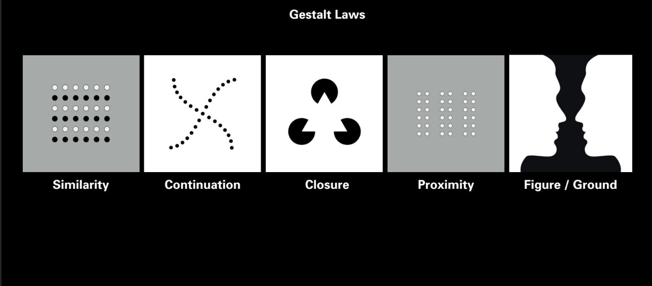
Revisit your 25 studies and look at them with fresh eyes, through these five gestalt principles of similarity, continuation, closure, proximity, figure/ground.
Create 5 new compositions using the 25 studies as a kit. 10″ × 10″. Black, white, & 1 color. No rules for color applications. Each composition should be based on one of the following gestalt principles of perceptual organization.
Each composition should be based on one of the following gestalt principles of perceptual organization.
Demonstrate:
• Similarity
• Continuation
• Closure
• Proximity
• Figure/Ground
Compositions should be printed and mounted to presentation board. Trim board flush with edge of the print. Label each with your name and date on the back.
• Mounting Supplies in RISD store:
• Museum Board Black 4 ply, 32”x40” $19.75
• Double Tack, $7.05
One print will be collected by your teacher for a show in the GD Commons at a later date.
Lecture: Gestalt + Final Deliverables
 See lecture slides on Google Drive
Find this at http://ds1618.risd.gd/2016/09/13/unit1_overview.html
2
Unit 02: Tom Ockerse
Question: How can the graphic medium enhance, enrich and deepen the verbal message?
In our engagement with the world and the routine to “make sense” of complexity, we take for granted the perceptual and holistic principles this interaction involves. Our perception of parts and configurations in a holistic system depends greatly on the use of so-called “gestalt” principles (i.e., similarity, continuity, figure-ground, etc.) and how these serve to communicate.
Since graphic design presents ideas primarily via graphic (= visual) means, awareness of these perceptual principles is critical for designers to help their products offer clarity and unity to stimulate user interaction and accessibility, curiosity and interest, inquiry and insight.
We will look into this power of graphic design to discover how an abstract (non-visual) object like a “word” (i.e., a verbal means to represent an idea) can be enriched significantly to provide a deep sense of insight and value for the ideas that word holds largely due to its visual delivery.
Learning Objectives
- Develop visual sensibilities
- Learn about “gestalt” principles and their holistic system as “language”
- Observe the power of the visual to affect the non-visual toward its poetic potential.
- Develop mind-mapping skills
- Become aware of the practice to design for experience
Lecture notes
Week 1 (September 27)
PHASE 1: Find your word
After the unit’s introduction each participant receives an object (same for all). In your studios first work individually to mind map* your identity with the object (what it means or can mean to you). After about 15 minutes of mind mapping select a single word from your map (for whatever reason or interest you have to connect to the object). For the next two weeks work only with this word.
For the next two weeks work only with this word.
Continue to work in class on the next phase (below) to write/typeset/draw the word.
PHASE 2: Write your word
In class: start to “write” (i.e., draw, use typography, build, etc.) your word. NOTE: do NOT START with the “mind map”! »Rather: start with experiencing the word and its parts to visually present the word.
Use only the word and its parts (letters, and their parts).
Inquire into and experiment with “writing” options: »tools, methods, structures, space-time configurations, media, dimensions, color, texture, parts of forms, the inner form, gestalt principles… to experience (observe, feel, sense) the visual forms. Work quickly to explore, generate and uncover a variety of visual options.
Important: do NOT add images or words, etc…..!
PHASE 3: Mind map the meaning of your word
After your studies of visual forms explore the meaning of your word this time via a NEW mind map to expand your awareness and depth of meaning. In this process also note what is of interests to you and why.
PHASE 4: Explore how the visual can embed meaning
Using ONLY the word continue to explore how the visual can embed meaning into the word’s graphic presentation:
perceptual/gestalt qualities for its elements (letter/forms, parts and wholes, spaces between, volume, etc.); their separate and relational per/form/ance, and the experience others could have with the word.
Begin to explore meaning in simple ways:
to write the word with an adjective in mind, and see how this influences your actions and decisions for visual forms, structures and expressions.
Keep an open mind to allow the visual search suggest insight into meaning options.
Search to harmonize meaning of concepts via visual means.
Consider: actions, visual expressions, configurations of parts, installation and placement, user interaction/experience (UI/UX), etc.
DUE October 4: Phases 1-4 In class present your ideas and process of inquiry. Do so in an organized fashion (digital and print) to efficiently share with the class the breadth and depth of your work and value of your search to help them appreciate the results.
Week 2 (October 4)
PHASE 5: Drive the poetic potential for your word
After class reviews continue to work in class on Phase 5, to further experiment with the means that can represent a depth of meaning for your word, and especially heighten the word’s (poetic) potential. In other words: optimize results. Consider the “ui/ux” aspects of the product toward this “poetic” end: how the means invite others to access, interact with, and experience the word toward its most meaningful, poetic potential.
DUE October 11: Phase 5 Final product of optimized results and a formal presentation of your process for inquiry and experiments to let the class become informed and appreciate the value of your inquiries.
Find this at http://ds1618.risd.gd/2016/09/26/unit2_overview.html
3
Use following template

For Week 2
Design 48 flags, print to plotter at actual size (flags should be 3 x 4.5”). Do not trim flags, but you may need to put a background shade for us to see the edges.
Printing instructions appear here. Print using Acrobat after you export a pdf from Illustrator.
Upload one flag to flagtest.nz and have open on your laptop for walkabout. You must use Chrome and upload a PNG or JPG.
For Week 3
Stay tuned…
Find this at http://ds1618.risd.gd/2016/10/18/unit3_week2.html
Unit 03: John Caserta
Question: How can we use symbols to unify a group of people?
The creation and appropriation of symbols to create meaning is an important part of a designer’s toolset – whether on a flag, website, emblem, logo or other context. This unit will take a close look at flags as an example of how symbols can connect (or distance) a group of people. Whether for nations, towns, labor unions, or schools, flags make use of the simplest of forms to communicate various cultural, historical or aspirational qualities of the group. This unit asks students to perform basic ethnographic research to better understand the values of a group, and to design symbols — sited on flags – that communicate those values.
Learning objectives
- Understand how symbols work
- Learn to work with simple forms
- Consider how material and context affects form — Learn to work together to accomplish more
- Learn about others and your values

Core Assignment:
Design a flag to fly at the top of Design Center. This should act as a symbol for the RISD GD Department, the primary tenant of the building.
WEEK ONE: Oct. 11 – 18
Inform yourself about the community for whom the flag represents. What holds the group together? Is there a common understanding of what RISD GD is (or GD generally) or what it should be? How can a flag unite the group? How can a flag pull the group towards an ideal or belief? How can a flag (symbol) distinguish this group from others? How have others solved this problem?
Research is part of the design process, and can be done in creative and unique ways. This project requires a few types of research: material/contextual research, research into symbols more generally, and ethnographic research (understanding the community being represented/served).
For next week: Produce a keynote of research of what you found, acknowledging each of the three areas. You will work in groups of three or four, with each person taking on one of the three areas, and combining those findings into one keynote presentation with each other and presenting to the class.
Material/Contextual Research
- How are flags made or constructed? What is possible? What is standard?
- Find flags that you think are successful.
- Find flags that relate to the subject matter at hand (unions, other GD programs, other RISD programs, etc).
Research into symbols
- How have shapes, colors been used to communicate ideas? Propaganda, etc
- Are there flags or symbols used by other graphic design organizations or departments?
- What symbols make sense for the content/group more generally
- Flags
Ethnographic Research
- Who are we now? Who/what have we been in the past?
- How do we work?
- What is the building like? Its texture, its geometry, its character?
- How are we different than other Departments, Schools, Buildings?
- Based on what you’ve collected, what is your vision?
Be sure to sketch and think about the ‘final’ flag as you research.
Lecture Notes
Lecture References below can be viewed in the folder
Ethnographic research
- “An Attempt at Exhausting a Place in Paris”, Georges Perec
- Bill Moggridge on People
- Norman Potter. What is a designer “Asking Questions”
- IDEO method cards
- Additional resources
Material/Contextual Research
- Good Flag, Bad Flag, North American Vexillogical Association
- Designing a good flag
- 99% invisible episode
- John Oliver on New Zealand flag redesign
- Testing flags
Symbols
- Symbol Sourcebook (in GD Commons)
- A design brief for the ages by Tim Maly
- Scott McCloud on detail/drawings/meaning
- Google Cultural Institute
- Heller, Steven. The Swastika: Symbol Beyond Redemption? New York: Allworth Press, 2000.
- Make your own coat of arms
WEEK TWO: OCT 18 – 25
Design 48 flags, print to plotter (42” x 28”) at actual size (flags should be 3 x 4.5”). Do not trim flags, but you may need to put a background shade behind certain flags to see white.
Upload one flag to flagtest.nz and have open on your laptop for walkabout.
WEEK THREE: OCT 25 – NOV 1
Make one flag printed and trimmed at 22” x 33”. Pencil your name lightly on the back. Hand this in on November 1 at the start of class.
Write a caption for the piece (150 word max) and place onto the Google Doc Shared with you. The caption should mention consider these questions: what does the flag symbolizes (and/or what the individual parts symbolize)? Why would this unify the community and/or how do you predict the public would see the community? (What is your intention?)
Additionally, remember you will be creating a reflective document at the end of the semester. In preparation for this, you should note which of your flags you would like to include in the document. And more importantly, what did you learn about RISD GD, Graphic Design the profession, the Design Center, your own goals/ambitions for your the community? Please list out the research that was instrumental in you forming your designs. What were you trying to communicate? Did some of the visual moves that you came up with begin to inform your ideas?
Find this at http://ds1618.risd.gd/2016/10/11/unit3_overview.html
4
Consider these questions while taking notes
Did the video show you how to do the thing?
Did the structure of the video assist or “overwhelm” the intended narrative?
How successful was the use of “graphic devices” (numbers, arrows, etc.)?
Did the video use the time allotment (two minutes or less) to advantage?
Did the video use camera angles, cutting, close ups, continuity, and an effective compositional structure to advantage?
Was there a sense of distinct voice?
Which 1-3 films do you want to discuss/remember?
Find this at http://ds1618.risd.gd/2016/11/08/unit4_crit.html
Unit 04: Tom Wedell
Question: How does the sequencing of information affect communication?
One of the main concepts necessary to understanding the design process is the use of TIME. Careful ordering and distribution of information is essential to successful communication.
In the expanded world of Graphic Design time plays a major role. Not only in how we engage in the design of an exhibit or screen based project, but also in the considerations a designer must build into two-dimensional “fixed” surfaces, such as signs, books, posters, and charts.
The graphic designer today must learn to master the art of pacing. How a viewer encounters information in a specific sequence and the pace at which that information is viewed, is one of the basic elements of communication. The order in which ideas are accessed is at the essence of any design project.
Learning objectives
- Gain an understanding of effective editing and how the proper sequencing of information enhances how that information is understood.
- Develop a critical awareness of time and how it affects the reading of a design.
- Communicate ideas/thoughts/images to others.
- Understand framing how composition emphasizes meaning.
- Build basic digital video production skills.
- Identify and test the properties of time such as rhythm, pacing, and repetition and how they are employed in visual communication.
Core Assignment
From the list of options below, pick one and create a video of two minutes or less that describes how to execute your chosen task without using words or voiceover. The video can be assembled from video clips, sequenced still photographic stills, drawings, or a any combination.
It is extremely important to adhere to the time limit of two minutes!
Pick ONE from the following:
- How to tie a bowline knot
- How to make perfect hard-boiled eggs
- How to tie a windsor knot
- How to iron a garment with a steam iron
- How to stretch a canvas for a painting
VIDEO SPECS
A two minute (or less) video: QuickTime FORMAT (.MOV; H.264; 720p)
Movies should ideally be less than 100MB, with dimensions no larger than 1280 x 720.
Movies larger than 250MB will be rejected.
Movies should follow this naming convention: Student Name_Instructor.mov
This information should also appear on a title card at the beginning of your film. Schedule:
FINAL videos given to John Sunderland (3rd floor) on Monday, Nov. 7th before 3pm.
Readings
- Essay on the Importance of Time. By M. Sanjeeta
- Notes on the Poetics of Time from: Temporality in Life as Seen Through Literature. By Lawrence Kimmel
Find this at http://ds1618.risd.gd/2016/10/25/unit4_overview.html
5
Unit 04: James Goggin
Question: Does design imply the idea of products that are necessarily useful?
The unit’s question is actually one of 29 questions originally posed by Musée des Arts Décoratifs curator Yolande Amic to Charles Eames, on the occasion of the exhibition Qu’est ce que le design? in 1969, as documented by the resulting 1972 film for Herman Miller, Design Q&A.
Eames’s answer? “Yes, even though the use might be very subtle”
Mme. Amic followed up with: “Is (design) able to cooperate in the creation of works reserved solely for pleasure?”
Eames: “Who would say that pleasure is not useful?”
This unit will question divisions and overlaps between beauty and utility, and between art and design. What makes something useful? What kind of use is deemed valid in design? Should design solve problems, eliminate labour, and/or aid in the creation of capital? Can a design that simply makes us laugh be considered “useful”?
We will conduct experiments and make proposals, aiming to challenge thinking about utility and beauty, and subvert conventions of common tools, formats, systems, and objects. As graphic designers we become connectors between — and participants in — authorship and production, and this position allows us to challenge expectations and provide utility in unexpected but entirely appropriate, even delightful, ways.
Learning Objectives
- Develop critical thinking about form and function
- Understand graphic design’s potential for editing, authorship, translation, and interpretation
- Explore and analyse historical and contemporary graphic design artifacts and formats
- Experiment with the possibilities of editing/altering/remixing/hacking in graphic design
- Build basic prototyping and presentation skills
- Furthering the critical analysis of your own work, its context, how it is circulated and used
Schedule
For Tuesday 8 November Bring a favourite piece of graphic design (for example, a book, logo, poster, record cover, website, app, calendar, magazine, etc.) to class next week, ready to show in class after the unit kick-off. Think about why you love this particular piece (for example, the use it provides, its visual qualities, its emotional resonance) and be prepared to share both it and your thoughts about it with your section in class.
WEEK ONE: Tuesday, Nov. 8
-
Lecture (see pdf notes)
-
Post-lecture: In-class show and tell of favourite piece
-
Describe your favourite piece of graphic design in detail, your own personal critical thoughts, what kind of use(s) it fulfills for you personally, and, in your opinion, to the design’s given audience at large. Was there a specific target audience in mind for this piece?
DUE WEEK TWO: Tuesday, Nov. 15
Assignment 1: Cover Version
Take your favourite design and make a new version of the piece by translating it into another, completely different format. Think about the medium and specificity of the original design, its original context(s), the intentions of the designer, and your own responses to it. What are some logical, or even surprising, situations that might change, yet still resonate with, the basic principles you have noted about the object? You might edit down the original design’s content or extent: editing is itself an important part of the design process. In all aspects of your process, visible and less visible, make confident, deliberate decisions with clear reasoning behind it (even if the reasoning is intuitive, emotional, improvisational).
DUE WEEK THREE: Tuesday, Nov. 29
Assignment 2: Useless Machine
Choose a common utilitarian format:
- app
- calendar
- clock
- poster
- publication
- sign
- website
- interface
Analyse the format’s common functions and its assumed interactions. Research historical and everyday examples. Look at variations from different cultures, in scale, in location.
Make a new useless version of your chosen format. Abstract it, edit it, reverse it, alter its message, subtract from it, add to it, slow it down.
As you abstract/edit/subtract from/add to your chosen format, identify new uses for your newly useless object, and act them out. The new use(s) might be subtle, or emotional, or sensory, or they might be completely functional in a new, unexpected way. Experiment by exchanging useless products with one another, observe and document behaviours that result.
Either work with an actual object, or make a physical (for a physical object) or digital (for a digital format) prototype. The IDEA is most important, and a carefully-produced way of communicating that idea in an appropriate form.
For final review (Tues Nov 29), you will present:
- Research showing examples and precedents of your chosen format
- Your new “useless” design
- Documentation (or live performance of) how your new useless design works
Image at top by Bruno Munari
Find this at http://ds1618.risd.gd/2016/11/07/unit5_main.html
etc
Design Studio 1 Reflective Document
As we near the end of the course reflect on your DS1 experiences, your inquiries and work, course content and methods, and what you learned. Then develop a written and illustrated overview of your experiences that reflects: on the whole course and your design process for each Unit. While NOT meant as a mere step-by-step “report” of your process (albeit inherent to include) DO SO in a reflective manner:
- that examines what you did and why,
- that notes experiments and failures,
- that critically evaluates developments and results,
- that speculates on what could improve results.
Describe your interests, criticism, enthusiasm, relational views, and insights gained! Of course, your daily/weekly “reflections” can weave into this.
Find this at http://ds1618.risd.gd/2016/11/15/relective.html
Sites to check out
Cheap thrills
Design criticism/reviews
Reference
Shop
Studios/Firms
Find this at http://ds1618.risd.gd/2016/09/16/urls.html
Design Studio 1
Rhode Island School of Design
Graphic Design, GRAPH-3210 req
Fall 2016, Tuesdays, 1:10 – 6:10pm
Graphic design occupies an ever-expanding, ever-redefined territory at the intersection of verbal and visual languages. Its media spans everything from websites to postcards, film to signage, typefaces to billboards. Its methods make use of both sides of the brain: pairing logic, critical analysis, research, and planning with intuitive search, mark-making and visual expression. Graphic designers are inquirers, observers, poets, editors, curators, analysts, researchers, commentators, and critics.
Rather than attempt to codify this expansive landscape, or to delineate a sequential path through it, this course takes this ambiguity as license for experimentation, discovery, and play. You will encounter and engage the tools, materials, and processes of graphic design in functional context, as means to self-directed ends.
The emphasis will be on methodologies of making — observation, analysis, ideation, translation, curation, research — and on developing a personal voice and approach.
Design Studio will take the form of a series of question-based units, each initiated by a faculty member and contextualized by a presentation, event, or workshop. Units may span the entire term, a few weeks, or a single class period. Design Studio is a fast-paced course that necessitates a self-directed, open-ended, experimental and playful mindset. Units will not define outcomes or prescribe processes, but rather will aim to inspire lines of enquiry, challenging students to explore unfamiliar subject matter, tools, media, and processes by their own initiative.
DS1 Overview
DS1 pushes students into a variety of directions, introducing critical tools, methods and content areas in the field. DS1 assumes no prior knowledge of tools or skills, but is not designed as ‘introductory’. Finished projects are not the intended outcome of DS1.
DS1 Units
Unit 01: Keetra Dean Dixon
How can you translate what you see into a graphic language?
In 1919 Kandinsky wrote an essay in which he used the metaphor of verbal “language” to discuss the laws of visual form, calling simple geometric shapes “forms belonging to the first sphere of graphic language.” He came up with the full metaphor of “visual language” not long after and it has since become a foundational concept in the study of graphic design.
In this unit, we’ll use the basic structures of language to lead an interpretive deconstruction of our surroundings, transforming them into a distinct graphic language. Just as paragraphs can be broken into words and words can be broken into letters, we’ll break photos of our environment into their basic formal elementals. We’ll translate those elements into new forms, exploring a variety of materials and tools as we go. Your collection of forms will then be used to create new compositions, a graphic language all your own.
Unit 02: Tom Ockerse
How can the graphic medium enhance, enrich and deepen the verbal message?
In engaging with the world around us, and our routine to “make sense” out of complexity, we take for granted the perceptual and holistic principles this interaction involves. That perception of parts and configurations as a holistic system depends greatly on the use of so-called “gestalt” principles (i.e., figure-ground, similarity, closure, etc.) and how these serve the purpose to communicate. Since graphic design presents ideas primarily via graphic means, awareness of these perceptual principles is critical for designers to help their products stimulate clarity and unity, curiosity and interest, inquiry and insight. We will look into this power of graphic design to discover how an abstract (non-visual) object like a “word” (i.e., a verbal means to represent an idea) can be enriched significantly toward a deep sense of poetic insight due to its combined graphic/visual delivery, and thus provide a lasting impression of value for the ideas it holds.
Unit 03 John Caserta
How can we use symbols to unify a group?
The creation and appropriation of symbols to create meaning is an important part of a designer’s toolset – whether on a flag, website, emblem, logo or other context. This unit will take a close look at flags as an example of how symbols can connect (or distance) a group of people. Whether for nations, towns, labor unions, or schools, flags make use of simple forms to communicate cultural, historical or aspirational qualities of the group. This unit asks students to perform basic ethnographic research to better understand the values of a group, and to design symbols — sited on flags – that communicate those values.
Unit 04 Thomas Wedell
How does the sequencing of information affect communication?
One of the main concepts necessary to understanding the design process is the use of time. Careful ordering and distribution of information is essential to successful communication.
In the expanded world of graphic design, time plays a major role. Not only in how we engage in the design of an exhibit or screen based project, but also in the considerations a designer must build into two-dimensional “fixed” surfaces, such as signs, books, posters, and charts.
The graphic designer today must learn to master the art of pacing. How a viewer encounters information in a specific sequence and the pace at which that information is viewed, is one of the basic elements of communication. The order in which ideas are accessed is at the essence of any design project.
Unit 05 James Goggin
Does design imply the idea of products that are necessarily useful?
In 1969, the French curator Yolande Amic posed this very question to designer Charles Eames. His reply? “Yes, even though the use might be very subtle.” The unit will question divisions and overlaps between beauty and utility, and between art and design. What makes something useful? What kind of use is deemed valid in design? Should design solve problems, eliminate labour, and/or aid in the creation of capital? Can a design that simply makes us laugh be considered “useful”?
We will conduct experiments and make proposals, aiming to challenge thinking about utility and beauty, and subvert conventions of common tools, formats, systems, and objects. With the overview we are often afforded as connectors between — and participants in — authorship and production, graphic designers have the power to challenge expectations and provide utility in unexpected but entirely appropriate, even delightful, ways.
Sections
01 John Caserta jcaserta@risd.edu
Room 210
02 Tom Ockerse tockerse@risd.edu
Room 208
03 James Goggin jgoggin@risd.edu
Room 211
03 Keetra Dean Dixon kdixon01@risd.edu
Room 212
05 Thomas Wedell twedell@risd.edu
Room 209
Objectives
- Develop habits for self-directed research and inquiry
- Develop critical thinking skills
- Develop rhetorical, communication and presentation skills
- Encourage a pluralistic approach to design problems
- Encourage work with emerging media
- Address and participate in contemporary social and cultural issues (in design)
- Place present day challenges within historical context
Semester-long Deliverables
- Sketchbook. Collect your thoughts, sketches and observations somewhere
- Research/Inspiration Blog. Think of this as the digital equivalent of your sketchbook. Collect digitally native material (websites, videos, etc) somewhere. May we suggest: tumblr, arena, dropmark, pinterest, google drive
- Reflective Notes as insights or awareness on a curiosity, excitement, or experience. Writing notes about your previous work will help to compile the reflective document at the end of the semester.
Grading
Grades in D.S. do not emphasize end products, but the necessary work that leads to successful end products. Evidence of your effort and competency are visible in the research blog(s), sketchbook, participation in class, and completion of the unit assignments as directed by the faculty. The below categories are meant to make assessment more clearly measurable by student and faculty alike.
20% Contribution Attendance, participation, motivation and personal commitment 20% Inquiry Research, search, study, and networking of knowledge and insights 20% Breadth Range of experience, willingness to experiment, take risks and broaden horizons 20% Depth Attention to the quality of ideas, critical thought and authenticity and voice 20% Finish Demonstration of skills in craft, visual design, presentation and communication
Etiquette
Be present. Consider taking notes with pencil and paper, it has been shown to help you remember – and unexpected doodles may occur. Students should arrive on time and prepared for each class. Three unexcused absences will result in failure of the course.
Schedule
Week Date 01 Sep 13 Course Overview Unit 1 Begins (Keetra) 02 Sep 20 Unit 1 continues 03 Sep 27 Unit 1 finish Unit 2 Begins (Tom O.) 04 Oct 04 Unit 2 continues 05 Oct 11 Unit 2 finish Unit 3 Begins (John) 06 Oct 18 Unit 3 continues 07 Oct 25 Unit 3 finish Unit 4 Begins (Tom W.) 08 Nov 01 Unit 4 continues 09 Nov 08 Unit 4 finish Unit 5 Begins (James) 10 Nov 15 Unit 5 continues 11 Nov 29 Unit 5 finish 12 Dec 06 TBD 13 Dec 13 Review Day
Find this at http://ds1618.risd.gd/2016/09/12/ds1syllabus.html